6.2 Examples
6.2.1 Swimmer Plot
For this example we use the swimplot package for plotting. It makes the creation of swimmer plots very easy and is based on ggplot2 and thus allows nice customizations. However, if even more customization is required, swimmer plots can also be created by using ggplot2 only.
A little demo how you could use the package is given below, in case you would like to find out more, you can check out this.
6.2.1.1 Packages and Sample Data
# Packages
library(haven)
library(swimplot)
library(dplyr)

# Data
adam_path <- "https://github.com/phuse-org/TestDataFactory/raw/main/Updated/TDF_ADaM/"
adsl <- haven::read_xpt(paste0(adam_path, "adsl.xpt"))
adae <- haven::read_xpt(paste0(adam_path, "adae.xpt"))
adtte <- haven::read_xpt(paste0(adam_path, "adtte.xpt"))
We have to apply some changes to the data so that they can be processed by the plot functions later on. The number of subjects is limited to 50 for display purposes and we create our own response duration variable because we only have the start date of the event given in those data.
adsl_new <- adsl %>%
  select(USUBJID, ARM, TRTDURD, SEX) %>%
  slice(1:50)
adae_new <- adae %>%
  select(USUBJID, AEDECOD, AESEV, AEREL, ASTDY) %>%
  filter(USUBJID %in% adsl_new$USUBJID & ASTDY >= 0)
adtte_new <- adtte %>%
  select(USUBJID, EVNTDESC, AVAL) %>%
  filter(USUBJID %in% adsl_new$USUBJID & EVNTDESC != "Study Completion Date")
random_duration_of_events <- sample(1:25, nrow(adtte_new), replace = T)
adtte_new <- adtte_new %>%
  bind_cols(random_duration_of_events) %>%
    mutate(Resp_end = AVAL + random_duration_of_events )
adsl_new <- as.data.frame(adsl_new)
adae_new <- as.data.frame(adae_new)
adtte_new <- as.data.frame(adtte_new)
6.2.1.2 Basic swimmer plot
A basic swimmer plot just consists of a simple bar chart.
swimmer_plot(df=adsl_new,
             id='USUBJID',
             end='TRTDURD',
             fill='lightblue',
             width=.85)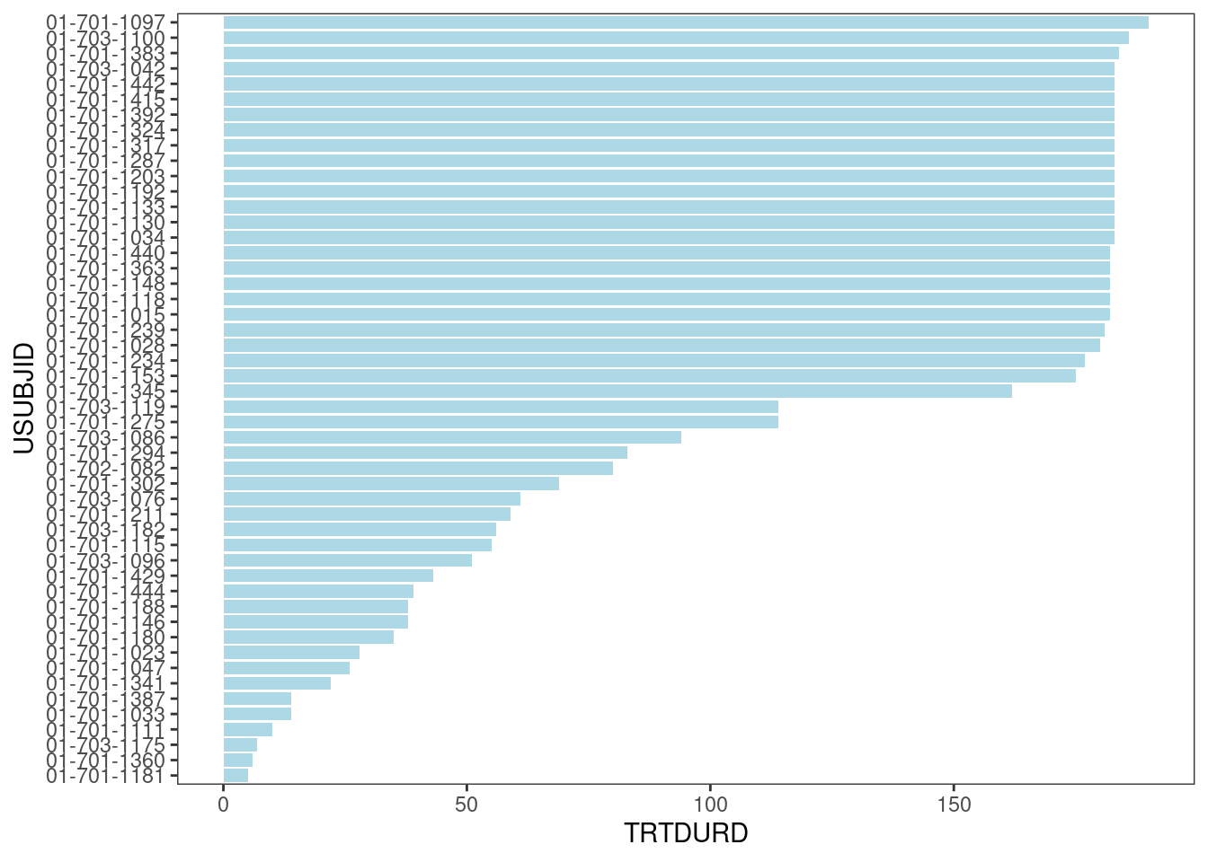
Now, treatment information is added.
arm_plot <- swimmer_plot(df=adsl_new,
                         id='USUBJID',
                         end='TRTDURD',
                         name_fill='ARM',
                         id_order='ARM',
                         col="black",
                         alpha=0.75,
                         width=.8)
arm_plot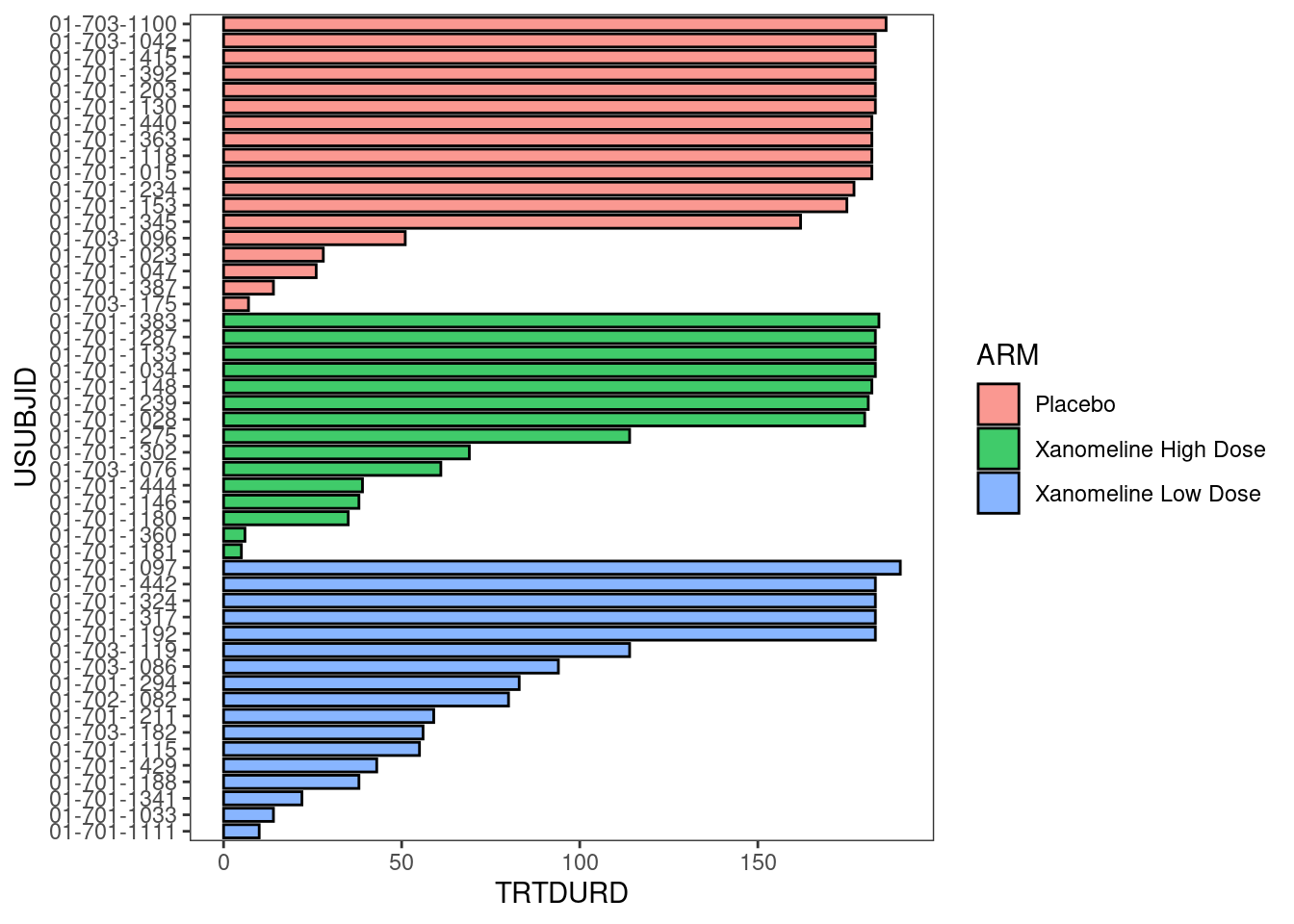
The plot could be stratified by any other variable of interest, in this case: SEX.
swim_plot_stratify <-swimmer_plot(df=adsl_new,
                                  id='USUBJID',
                                  end='TRTDURD',
                                  name_fill='ARM',
                                  col="black",
                                  alpha=0.75,
                                  width=.8,
                                  base_size=14,
                                  stratify= c('SEX'))
swim_plot_stratify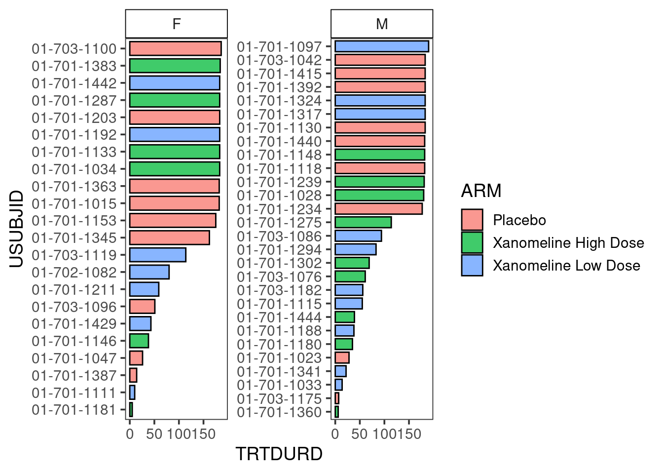
6.2.1.3 Adding adverse event information to the plot
AE_plot <- arm_plot +
  swimmer_points(df_points=adae_new,
                 id='USUBJID',
                 time='ASTDY',
                 name_shape='AESEV',
                 size=2.5,
                 fill='white',
                 name_col='AEREL')
AE_plot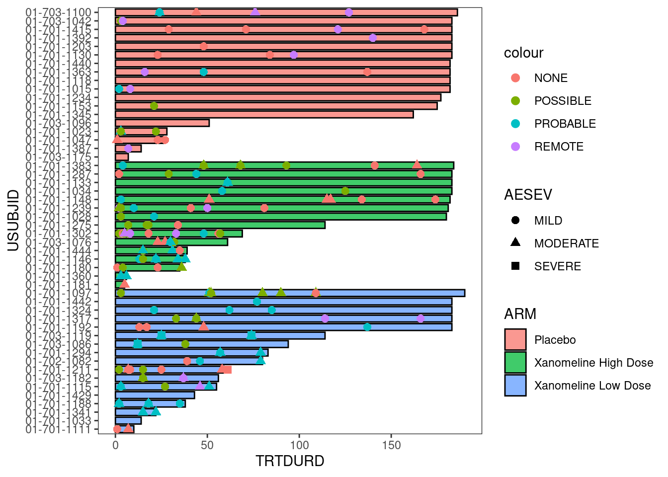
6.2.1.4 Adding time-to-event information to the plot
Response_plot <- arm_plot +
  swimmer_lines(df_lines=adtte_new,
                id='USUBJID',
                start ='AVAL',
                end='Resp_end',
                name_col='EVNTDESC',
                size=1)
Response_plot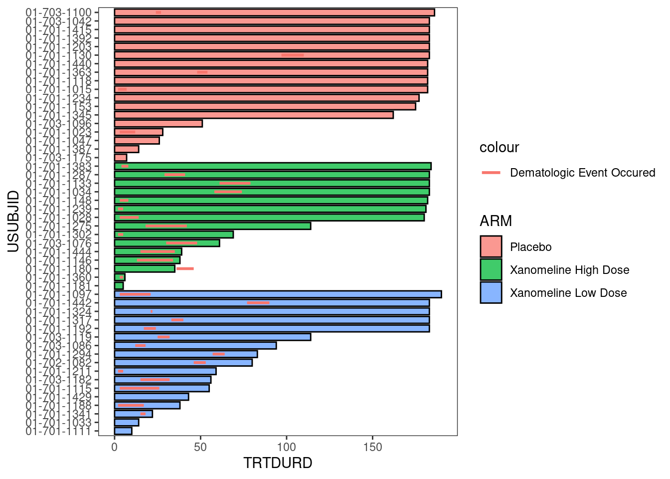
6.2.1.5 Customize plot
Response_plot_with_points <- Response_plot +
  swimmer_points_from_lines(df_lines=adtte_new,
                            id='USUBJID',
                            start='AVAL',
                            end='Resp_end',
                            name_col='EVNTDESC',
                            size=2) +
  scale_fill_manual(name="Treatment",
                    values=c("Placebo" ="#A9342F",
                             "Xanomeline High Dose"="#5B7ACE",
                             "Xanomeline Low Dose"='#FFC300'))+
  scale_color_manual(name="Response",
                     values=c("grey20"))+
  scale_shape_manual(name='',
                     values=c(17,15),
                     breaks=c('AVAL','Resp_end'),
                     labels=c('Response start','Response end'))+
  guides(fill = guide_legend(override.aes = list(shape = NA))) +
  scale_y_continuous(name = "Time since enrollment")

Response_plot_with_points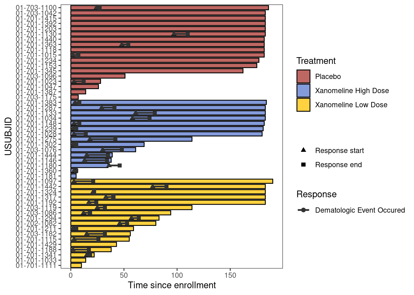
6.2.2 Waterfall Plot
6.2.2.1 Packages and Sample Data
# Packages
library(gridExtra)
library(grid)

# Data
wp <- data.frame(subjidn = 1:30,
                 trtp = sample(c('Drug','Placebo'), replace = T, 30),
aval = runif(30, min = -40, max = 40))| subjidn | trtp | aval |
|---|---|---|
| 1 | Placebo | 38.97187 |
| 2 | Placebo | -15.70445 |
| 3 | Drug | 36.48011 |
| 4 | Placebo | 17.66958 |
| 5 | Drug | -29.28092 |
| 6 | Placebo | 17.50244 |
6.2.2.2 Basic Waterfall Plot
Create an initial waterfall plot
basic_waterfall <- ggplot(wp, aes(y = aval,x = reorder(subjidn, -aval))) +
  geom_bar(stat = "identity")

basic_waterfall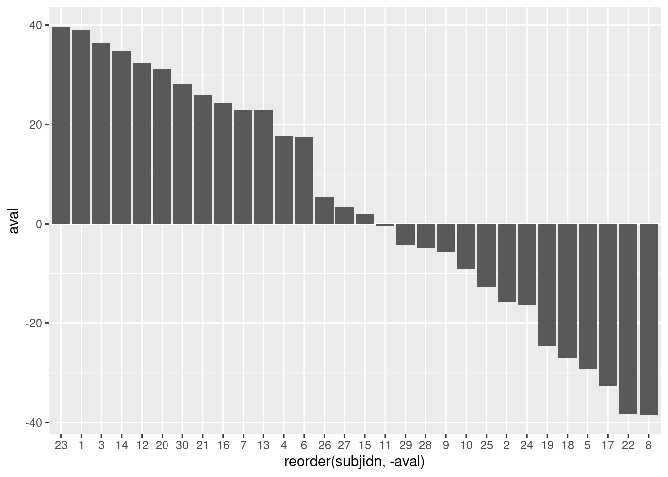
6.2.2.3 Adding Customizations
Add a few customizations to the waterfall plot
- Bar fill color is determined by trtp value
- Specify custom colors, name the legend
- Specify Y-axis goes from -40 to 40, by increments of 10
- Add in a Y-axis label
- Specify a base theme
- Remove the X-axis
- Move legend to bottom of graph
6.2.2.4 Customized Waterfall Plot
custom_waterfall <- ggplot(wp, aes(y = aval, x = reorder(subjidn, -aval), fill = trtp)) +
  geom_bar(stat = "identity") +
  scale_fill_manual("Planned Treatment Arm", values = c('#00bbff','#89d329')) +
  scale_y_continuous(limits = c(-40,40), breaks = seq(-40, 40, by = 10)) +
  ylab("Maximum reduction of tumor size (%)\n") +
  theme_light() +
  theme(axis.title.x = element_blank(),
        axis.line.x  = element_blank(),
        axis.text.x  = element_blank(),
        axis.ticks.x = element_blank(),
        legend.position = "bottom")

custom_waterfall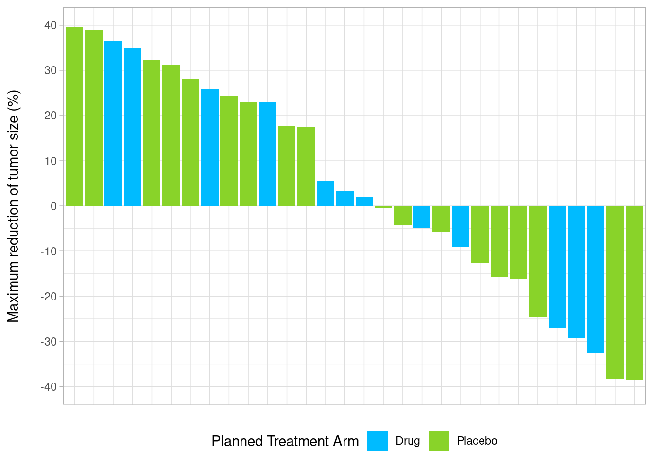
6.2.2.5 Study Example
A special waterfall plot layout is needed in a real study. In this layout, biomarker information in the subject level needs to be added at the bottom of the waterfall plots.
The dataset for the plot was derived from ADRS and ADSL in SAS; simulated data is used in this demo.
Simulate Data:
set.seed(100)

n <- 120   # size/records of simulated data

dat_all <-
  data.frame(SUBJID = 120010100:(120010100+n-1),
           AVAL = c(rnorm(round(0.8*n), 0, 20), rep(0, round(0.2*n))) %>% sample(),
           OVERALLRESP = c("PR", "SD","PD") %>% sample(size=n, replace=TRUE),
           AMEDGRPN = seq(10, 50, 10) %>% sample(size=n, replace=TRUE),
           DOR = rpois(n, 40),
           AVISIT = c("C1", "C2", "C3","EOT") %>% sample(size=n, replace=TRUE),
           ATMLOSS_L = c("E", "L", "Data unavailable") %>% sample(size=n, replace=TRUE),
           ATMLOSS_P = c("E", "L", "Data unavailable") %>% sample(size=n, replace=TRUE),
           ATMLOSS_R = c("E", "L", "Data unavailable") %>% sample(size=n, replace=TRUE),
           IDFOOT = "Bayer: /study/path/.../f_waterfall.sas               30NOV2021 16:06"
           ) %>%
mutate_at(vars("OVERALLRESP", "DOR", "IDFOOT"), as.character)- X: SUBJID
- Y: AVAL (derived from ADRS.AVAL when ADRS.PARAM = “Maximum Tumor Reduction (%)”)
- Label: OVERALLRESP (derived from ADRS.AVAL when ADRS.PARAM = “Best Overall Response”)
- Subset: AMEDGRPN (5 groups)
- A graph function is created in the real study for different analysis groups, in this demo, we subset data to AMEDGRPN = 50.
| SUBJID | AVAL | OVERALLRESP | AMEDGRPN | DOR | AVISIT | ATMLOSS_L | ATMLOSS_P | ATMLOSS_R |
|---|---|---|---|---|---|---|---|---|
| 120010100 | 28.56603 | SD | 50 | 31 | EOT | Data unavailable | E | L |
| 120010120 | 35.14751 | PD | 50 | 36 | C3 | Data unavailable | E | Data unavailable |
| 120010121 | -23.24839 | PD | 50 | 37 | EOT | E | Data unavailable | Data unavailable |
| 120010128 | 46.20594 | PR | 50 | 44 | C2 | Data unavailable | E | E |
| 120010134 | 0.00000 | PD | 50 | 58 | C3 | Data unavailable | Data unavailable | E |
| 120010135 | -45.43851 | PR | 50 | 31 | C2 | Data unavailable | L | L |
Create a waterfall plot with simulated data and below customization
- Add x/y-axis labels through function “labs”
- SUBJID has long digits, below functions are used to avoid overlapping at x-axis:
- function stringr::str_wrap: add split character “” between digits
- function gsub: add space between digits to enable the use of str_wrap
- function stringr::str_replace_all: remove space
- Specify legend title, order/colors (similar to SAS sgplot - dattrmap)
- Annotation on the top of the bar when Y=0
- Adjust background, legend, and size/color/font of x/y-axis aesthetics through Theme
waterfall.plot <- dat %>% ggplot(aes(reorder(SUBJID, -AVAL), AVAL, fill =OVERALLRESP)) +
    geom_bar(stat="identity") +
  labs(x = "Subject",
       y = "Best % Change from baseline \n in sum of diameters \n (target lesions)\n") +
  scale_x_discrete(labels = function(x) stringr::str_wrap(gsub("([0-9])([0-9])", "\\1 \\2 ", x),
                                                     width = 5) %>%
                     stringr::str_replace_all(" ", "")) +
  scale_fill_manual("Best Response",
                    breaks = c("PR", "SD","PD"),
                    values=c("PR"='#89d329',
                             "SD"="#756bb1",
                             "PD"='#00bbff')) +
  geom_text(aes(label = if_else(AVAL == 0,OVERALLRESP,""),fontface="bold"),
            vjust = -1,
            size=3,
            color="black") + theme_bw() +
  theme(
    axis.text = element_text(size=12,color="black",face = "bold"),
    axis.title.y = element_text(size=12, face="bold"),
    axis.title.x = element_blank(),
    legend.background = element_rect(color = "steelblue", linetype = "solid"),
    legend.justification = c(1, 1),
    legend.position = c(1, 1),
    legend.direction = "horizontal",
    legend.text = element_text(size=8, color = "black", face = "bold"),
    legend.title = element_text(size=8, color = "black", face = "bold"),
    plot.caption = element_text(hjust = 0, size = 10, color = "blue"),
    plot.caption.position =  "plot"
  )

waterfall.plot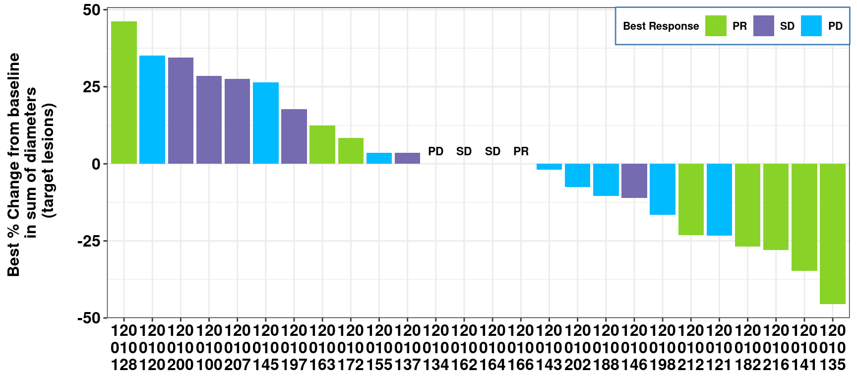
As requested from the study, more information at subject level needs to be added in the bottom of the waterfall plots. Thus, two more plots are created (add-in plot1/2) to display the subject level information.
- Add-in plot 1: visit and duration of response information at subject level
var <- c("DOR", "AVISIT")
var_label <- c("Duration (days)", "Timepoint")

add.plot1 <- dat %>%
  reshape2::melt(measure.vars = eval(var), value.name = "label", variable.name = "layer") %>%
  mutate(layer = factor(layer, levels = var, labels = var_label)) %>%
  ggplot(aes(reorder(SUBJID, -AVAL))) +
  geom_text(aes(y = layer, label = label), size = 3, fontface = "bold") +
  labs(y = "", x = NULL) +
  theme_minimal() +
  theme(
    axis.text.y = element_text(
      size = 10,
      colour = "black",
      face = "bold"
    ),
    axis.line = element_blank(),
    axis.ticks = element_blank(),
    axis.text.x = element_blank(),
    panel.grid = element_blank(),
    strip.text = element_blank()
  ) +
  coord_fixed(ratio = .8)
add.plot1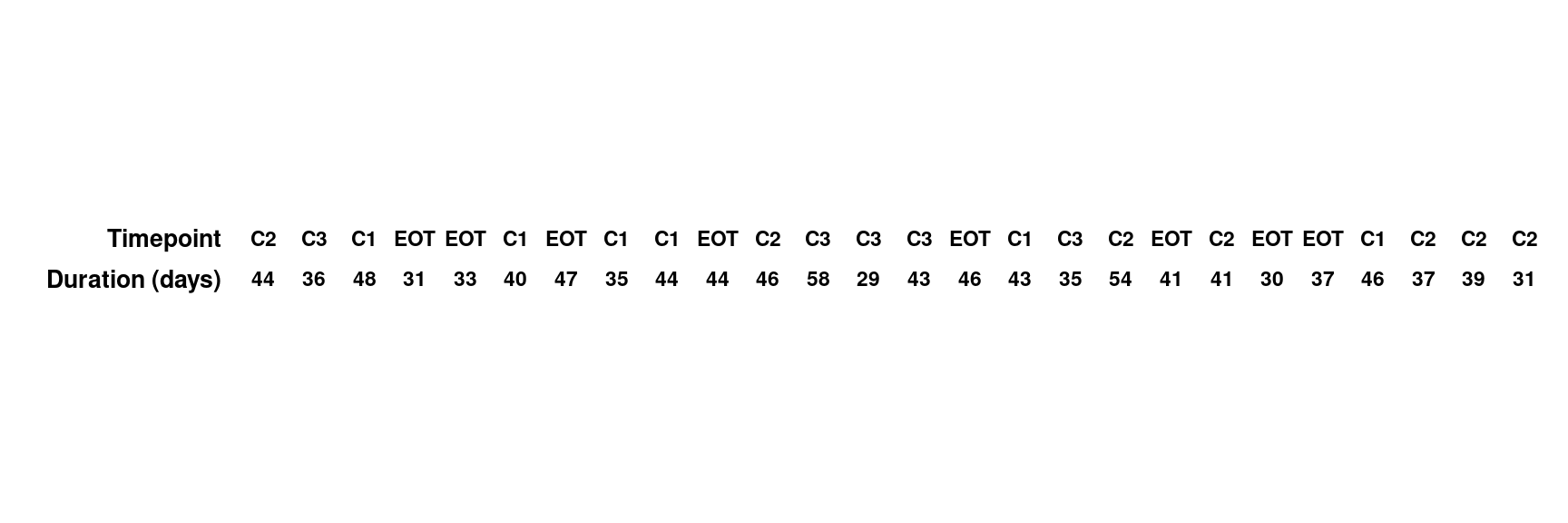
- Add-in plot 2: biomarker-related information at subject level, footnotes are added in this plot
- wrap long footnote by adding "\n" or using stringr::str_wrap
- display SAS macro variable “&idfoot.”
Footnotes:
footnote1 <- 'Footnote1: "\\n\" can be used to split long footnote into next line.'
footnote2 <- "Footnote2: To avoid manually adding split character. The function stringr::str_wrap   can be used here to wrap the long text with a specified width."
footnote <- lapply(c(footnote1,
                     footnote2,
                     "",
                     dat$IDFOOT[1]),
                   function(x) stringr::str_wrap(x, width=120)) %>% # apply str_wrap to individual footnote
  unlist() %>%       # convert list structure to vector
  stringr::str_flatten('\n')  # add split character(new line) between footnotes
var <- c("ATMLOSS_L", "ATMLOSS_P","ATMLOSS_R")
var_label <- c("Local", "Prospective", "Retrospective")
add.plot2 <- dat %>%
reshape2::melt(measure.vars = eval(var),
value.name = "label",
variable.name = "layer") %>%
mutate(label=case_when(
label == "L" ~ "ATM Loss",
label == "E" ~ "ATM Expressed",
label == "9" ~ "Data unavailable",
TRUE ~ label
)) %>%
mutate(layer = factor(layer, levels = rev(var), labels = rev(var_label))) %>%
ggplot() +
aes(reorder(SUBJID, -AVAL), layer, color=label,shape=label) +
geom_point(size=3)+
scale_shape_manual(breaks = c("ATM Loss","ATM Expressed", "Data unavailable"),
values = c("ATM Loss"=15,"ATM Expressed"=0,
"Data unavailable"=7))+
scale_color_manual(values = c("ATM Loss"="black", "ATM Expressed"="black",
"Data unavailable"= 'black'))+
theme_classic()+
theme(axis.text=element_text(size=10, colour = "black",face = "bold"),
axis.title=element_blank(),
axis.line = element_blank(),
axis.ticks = element_blank(),
axis.text.x = element_blank(),
legend.title = element_blank(),
legend.text = element_text(size=10, color = "black", face = "bold"),
legend.position = "bottom",
panel.border = element_blank(),
panel.grid = element_blank(),
strip.text = element_blank(),
plot.caption = element_text(hjust = 0, size = 10),
plot.caption.position = "plot"
)+
coord_fixed(ratio=.9)+
labs(caption = footnote)
add.plot2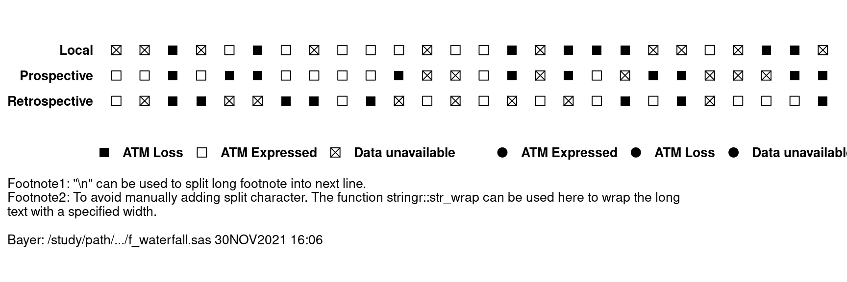
- The following functions are used to combine three plots aligned with x value.
- ggplot2::ggplotGrob
- gridExtra::gtable_rbind
- grid::grid.draw
- Align the three plots with the same x-axis (SUBJID).
- waterfall.plot
- add.plot1
- add.plot2
p1 <- waterfall.plot %>% ggplotGrob()
p2 <- add.plot1 %>% ggplotGrob()
p3 <- add.plot2 %>% ggplotGrob()
gtable_rbind(p1, p2, p3,
             size='first') %>% grid.draw()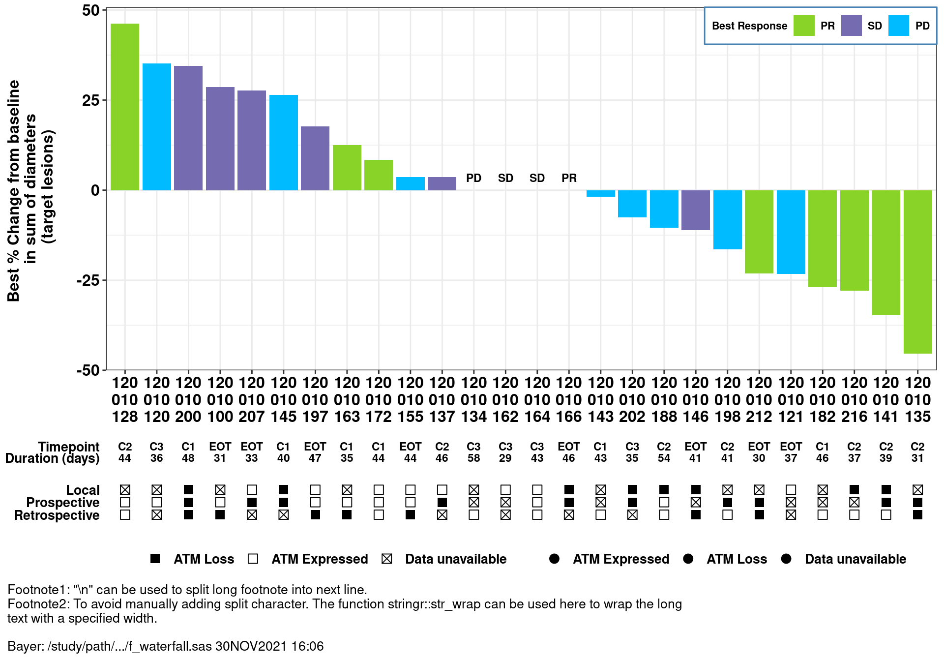
6.2.3 Spaghetti Plot
6.2.3.1 Packages and Sample Data
# Packages
library(gg.gap)

# Data
set.seed(100)

n <- 50   # number of subjects, each subject has 12 data points

spaghetti_sim <- data.frame(SUBJIDN = rep(1:n,each=12),
                            X = rep(1:12,n),
                            Y = c(rgamma((n*12-5), 5, 1), rnorm(5, 200,40)) %>% sample(),
TRT01AN = c("Drug","Placebo") %>% sample(size=n*12, replace=TRUE))| SUBJIDN | X | Y | TRT01AN |
|---|---|---|---|
| 1 | 1 | 6.998788 | Placebo |
| 1 | 2 | 5.381833 | Drug |
| 1 | 3 | 8.597700 | Drug |
| 1 | 4 | 5.774989 | Drug |
| 1 | 5 | 5.275945 | Drug |
| 1 | 6 | 2.945667 | Drug |
6.2.3.2 Basic Spaghetti plot
p_spaghetti <- spaghetti_sim %>%
  ggplot(aes(X, Y, group = SUBJIDN, colour = TRT01AN)) +
  geom_point() + geom_line(size = 0.3) + theme_bw() +
  labs(y="Y values",
       x="Months since start of study treatment",
       colour = "Actual Treatment for Period 01 (N)") +
  theme(legend.background = element_rect(size=0.1, linetype="solid",
                                         colour ="black"),
        legend.position="bottom", legend.box = "horizontal")
## Warning: Using `size` aesthetic for lines was deprecated in ggplot2 3.4.0.
## ℹ Please use `linewidth` instead.## Warning: The `size` argument of `element_rect()` is deprecated as of ggplot2 3.4.0.
## ℹ Please use the `linewidth` argument instead.p_spaghetti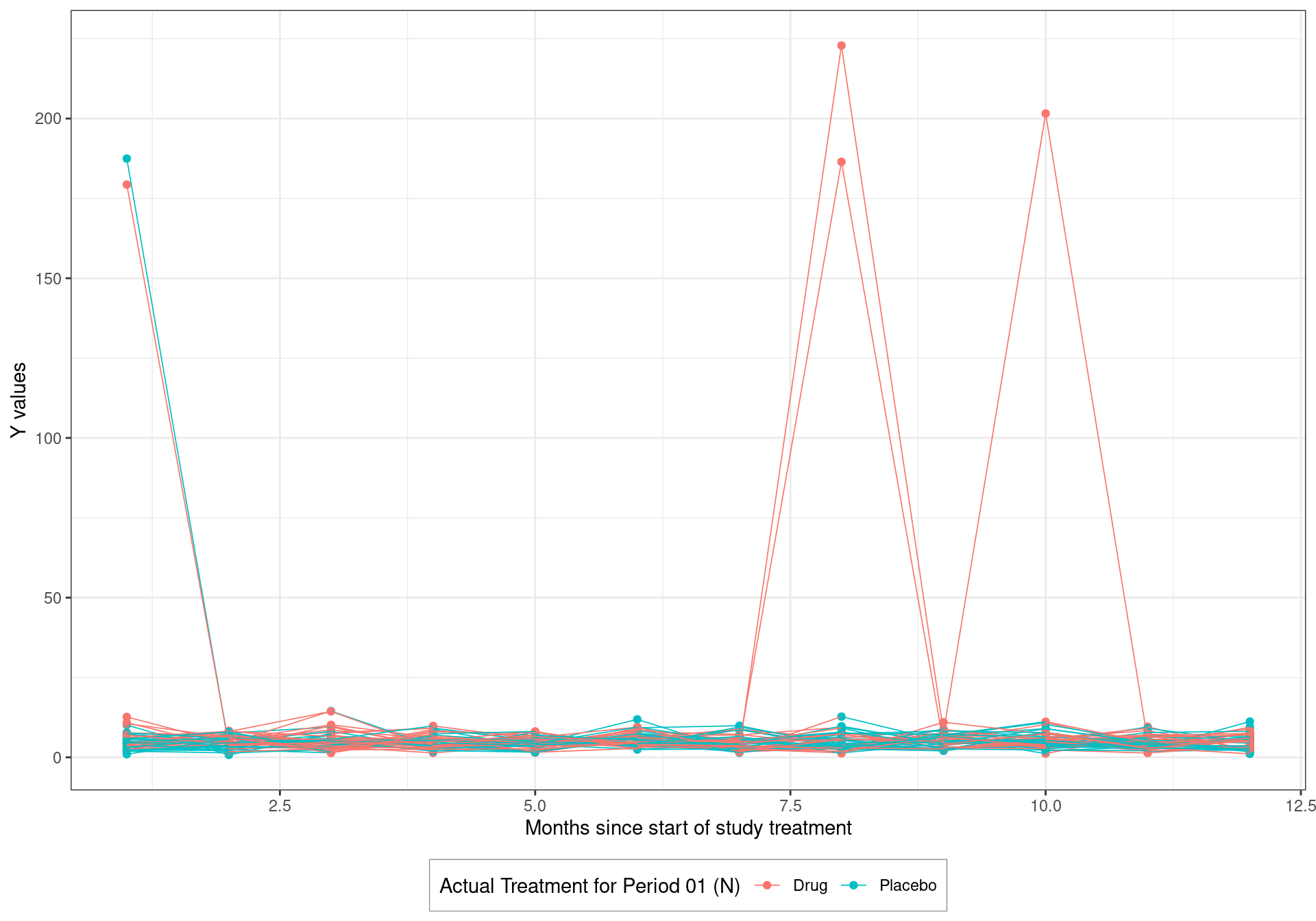
6.2.3.3 Spaghetti Plot with Broken Y
Different scales presented in the same plot when outliers are presented, to enlarge the detailed part of small values.
#library(gg.gap)

p_spaghetti_break <- gg.gap(plot=p_spaghetti, tick_width=c(1,70),
         segments=c(15,25), rel_heights=c(8,0,1),
         ylim=c(0,235))
p_spaghetti_break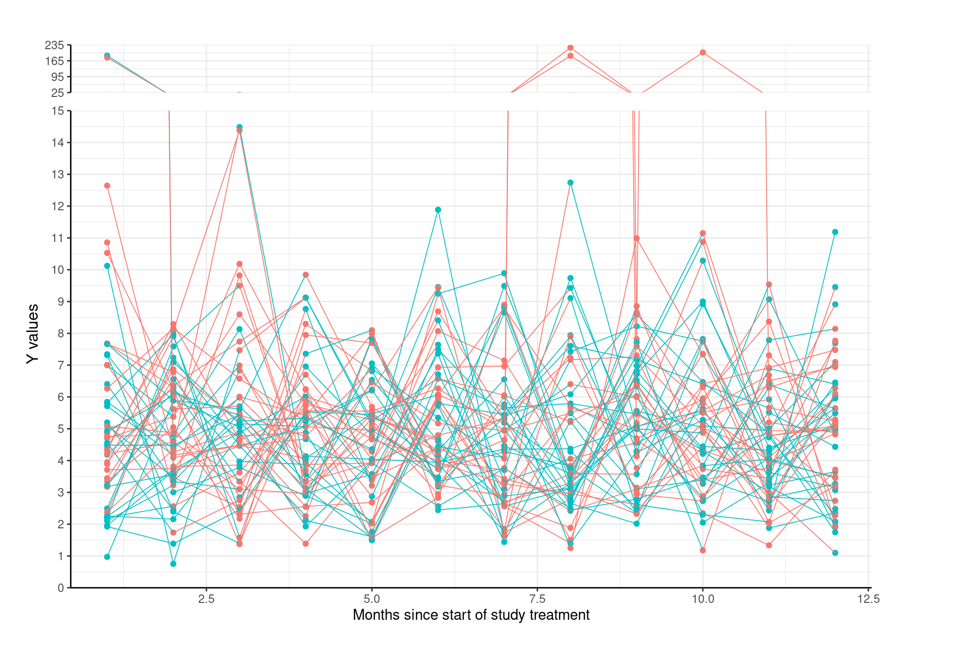
6.2.4 Spider Plot
6.2.4.1 Packages and Sample Data
Create a sample data set to visualize
# Packages
library(ggrepel)

# Data
sp <- data.frame(subjidn = rep(1:5, times = c(5,4,5,3,4)),
                 trtp = rep(c('drug','placebo'), times = c(8,13)),
                 avisit = c(0:4,0:3, 0:4, 0:2, 0:3),
                 aval = c(0,5,15,20,20,
                          0,-10,-20,-15,
                          0,-30,-25,-35,-30,
                          0,15,30,
0,-20,-15,-20))| subjidn | trtp | avisit | aval |
|---|---|---|---|
| 1 | drug | 0 | 0 |
| 1 | drug | 1 | 5 |
| 1 | drug | 2 | 15 |
| 1 | drug | 3 | 20 |
| 1 | drug | 4 | 20 |
6.2.4.2 Basic Spider Plot
basic_spider <- ggplot(sp, aes(x = avisit, y = aval, group = subjidn)) +
  geom_line()

basic_spider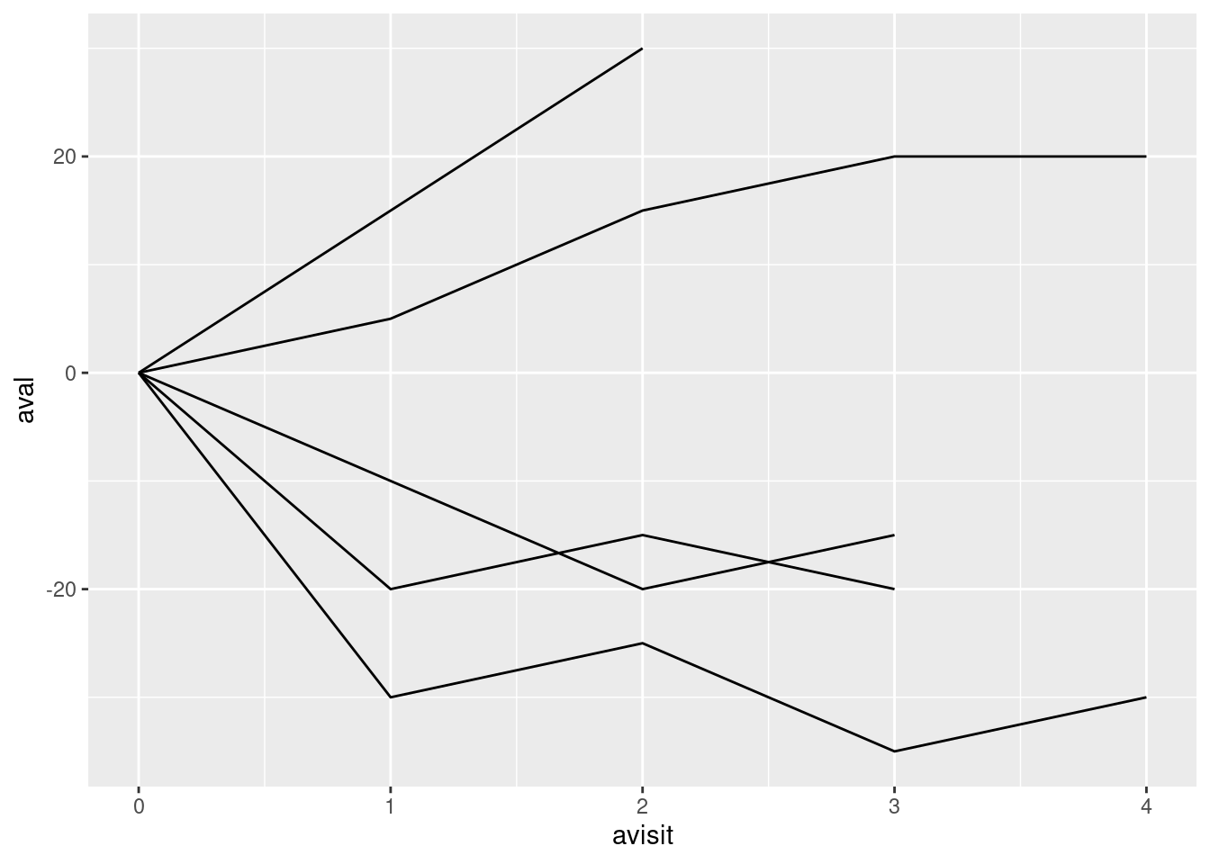
6.2.4.3 Adding Customizations
Add a few customizations to the spider plot
- Line color is determined by
trtpvalue - Add points to each line
- Add a dashed reference line at Y = 0
- Specify custom colors, name the legend
- Specify Y-axis goes from -40 to 40, by increments of 10
- Add in a Y-axis label
- Add in a X-axis label
- Specify a base theme
- Move legend to bottom of graph
6.2.4.4 Customized Spider Plot
custom_spider <- ggplot(sp, aes(x = avisit, y = aval, group = subjidn, color = trtp)) +
  geom_line() +
  geom_point() +
  geom_hline(yintercept = 0, linetype = "dashed") +
  scale_color_manual("Planned Treatment Arm", values = c('#00bbff','#89d329')) +
  scale_y_continuous(limits = c(-40,40), breaks = seq(-40, 40, by = 10)) +
  ylab("Change in Target Lesion from Baseline (%)\n") +
  xlab("Time (weeks)") +
  theme_light() +
  theme(legend.position = "bottom")

custom_spider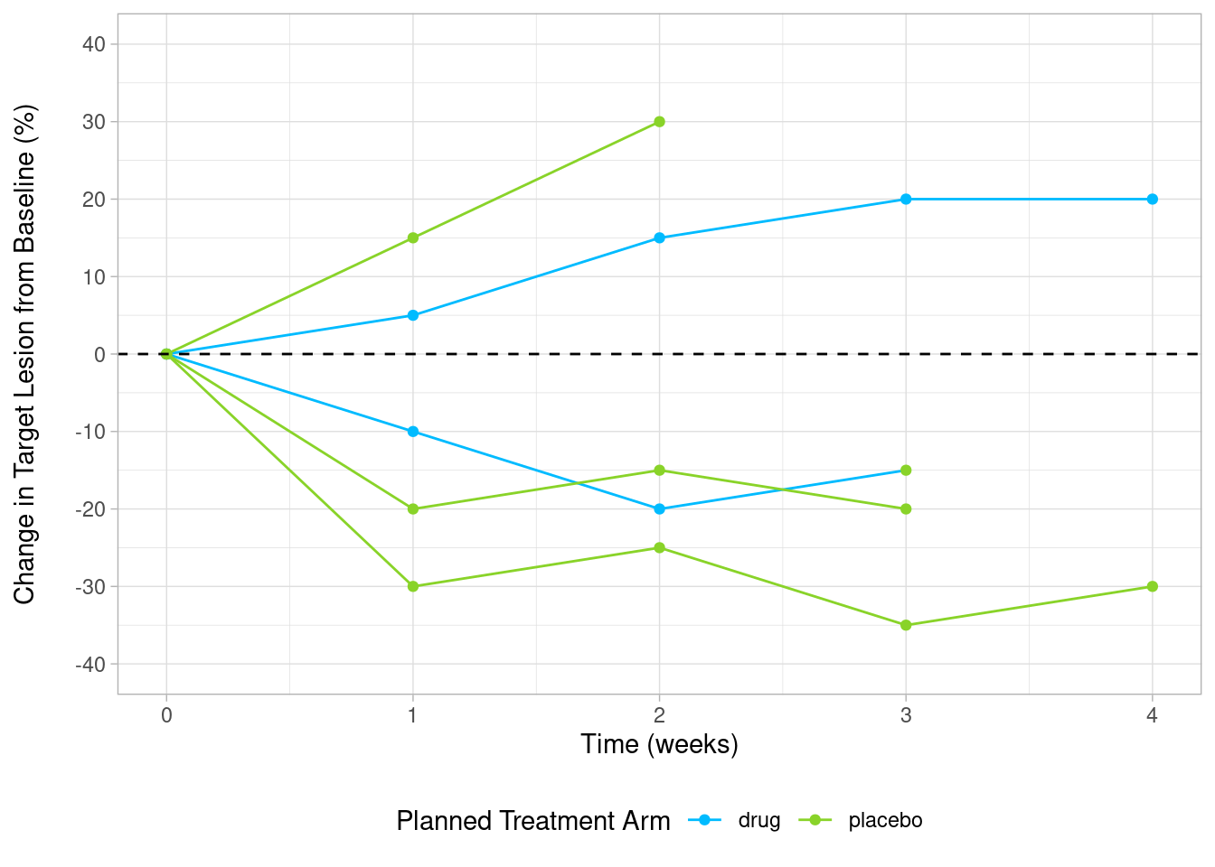
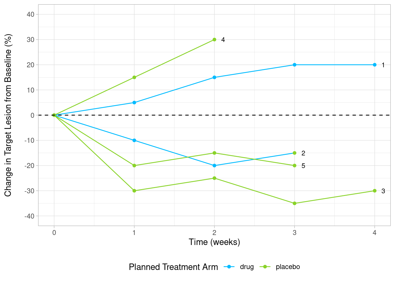
6.2.4.5 Subject Labels Customization
Add subject Labels (IDs) at the end of each line
sp_ends <- sp %>%
  group_by(subjidn) %>%
top_n(1, avisit) | subjidn | trtp | avisit | aval |
|---|---|---|---|
| 1 | drug | 4 | 20 |
| 2 | placebo | 3 | -15 |
| 3 | placebo | 4 | -30 |
| 4 | placebo | 2 | 30 |
| 5 | placebo | 3 | -20 |
# library(ggrepel)

custom_spider +
  geom_text_repel(
    aes(label = subjidn),
    color="black",
    data=sp_ends,
    size = 3,
    direction = "x",
    hjust = 1
  )
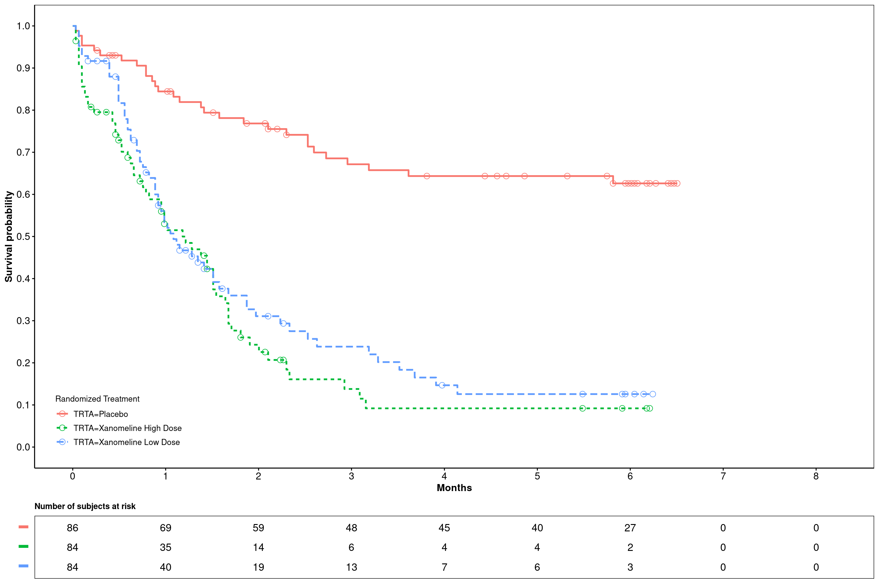
6.2.5 Survival Plot
6.2.5.1 Kaplan-Meier statistics and plotting
In the following example the survfit function from the survival package is used to calculate Kaplan-Meier statistics from time-to-event data. The model statistics can be inspected (using broom - a generic function to extract statistics from R models).
Passing the model to the ggsurvplot function from the survminer package creates a Kaplan-Meier curve. The configuration tries to mimic the known SAS output as close as possible (e.g. number at risk table style etc.).
6.2.5.2 Packages and Sample Data
# Packages
library(survminer)
library(survival)
library(broom)
library(flextable)

# Data
adtte <- haven::read_xpt(
  paste0("https://github.com/phuse-org/TestDataFactory/",
         "raw/main/Updated/TDF_ADaM/adtte.xpt"))
Filter time-to-event parameter and select required variables. The piping command directly passed filtered and selected data to the survfit function and creates the model.
Note: The event parameter from survival function (survival::Surv) is the status indicator, normally 0=alive, 1=death; while ADTTE.CNSR=0 usually means event occurred(e.g., death), ADTTE.CNSR=1 represents censoring. Thus, “1-CNSR” is used here to accommodate the CDISC ADaM standard.
This section is under construction
surv_model <- adtte %>%
  filter(PARAMCD == "TTDE") %>%
  select(STUDYID, USUBJID, PARAMCD, AVAL, CNSR, TRTA) %>%
  survfit(Surv(AVAL, 1-CNSR) ~ TRTA, data = .)
6.2.5.3 Inspecting fitted survival model
head(tidy(surv_model)) | time | n.risk | n.event | n.censor | estimate | std.error | conf.high | conf.low | strata |
|---|---|---|---|---|---|---|---|---|
| 1 | 86 | 1 | 0 | 0.9883721 | 0.0116961 | 1.0000000 | 0.9659724 | TRTA=Placebo |
| 2 | 85 | 1 | 0 | 0.9767442 | 0.0166390 | 1.0000000 | 0.9454046 | TRTA=Placebo |
| 3 | 84 | 2 | 0 | 0.9534884 | 0.0238163 | 0.9990514 | 0.9100033 | TRTA=Placebo |
| 7 | 82 | 1 | 0 | 0.9418605 | 0.0267913 | 0.9926390 | 0.8936795 | TRTA=Placebo |
| 8 | 81 | 0 | 1 | 0.9418605 | 0.0267913 | 0.9926390 | 0.8936795 | TRTA=Placebo |
| 9 | 80 | 1 | 0 | 0.9300872 | 0.0295973 | 0.9856369 | 0.8776683 | TRTA=Placebo |
6.2.5.4 Plotting custom configured Kaplan-Meier curves without confidence intervals
Note: Let´s assume a month is defined as 30.4375 (days); The xscale parameter d_m converts days (input) to month. If six months breaks are required for the numbers-at-risk table this would mean: break.x.by = 182.625 (6*30.4375).
 ggsurvplot(
   fit = surv_model,
   data = adtte,
   risk.table = TRUE,
   #ylab = ylabs,
   xlab = "Months",
   linetype = "strata",
   conf.int = F,
   legend.title = "Randomized Treatment",
   legend = c(0.1, 0.1),
   #palette = c(color_trt1,color_trt2),
   risk.table.title = "Number of subjects at risk",
   risk.table.y.text = F,
   risk.table.height = .15,
   censor.shape = 1,
   censor.size = 3,
   ncensor.plot = F,
   xlim = c(0,250),
   xscale = "d_m",
   break.x.by = 30.4375,
   break.y.by = .1,
   ggtheme = theme_survminer(
     font.main = c(10, "bold"),
     font.submain = c(10, "bold"),
     font.x = c(12, "bold"),
     font.y = c(12, "bold"),
   ) + theme(panel.border = element_rect(fill = NA)),
   tables.theme = theme_cleantable()
 )
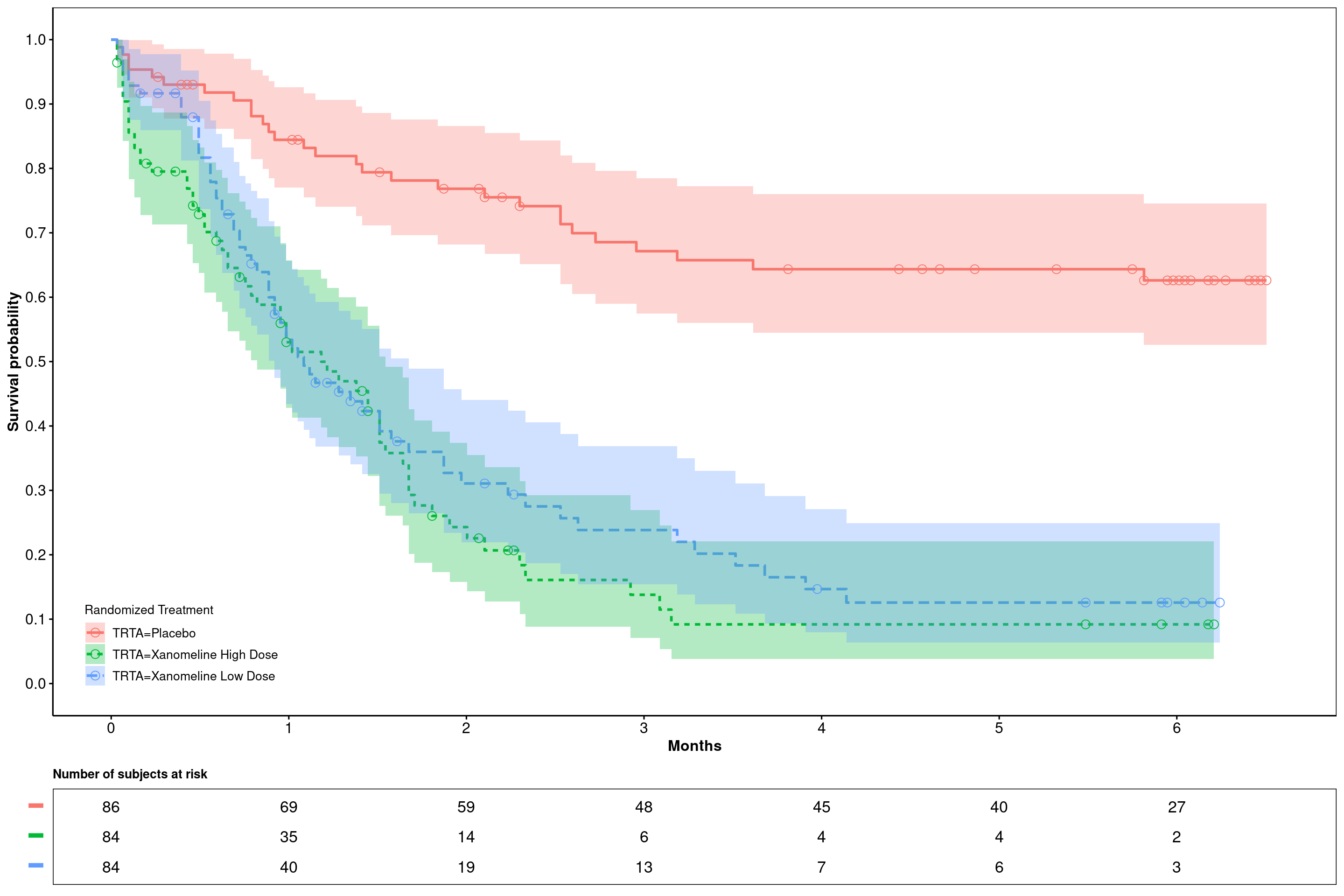
6.2.5.5 Plotting custom configured Kaplan-Meier curves with confidence intervals
 ggsurvplot(
   fit = surv_model,
   data = adtte,
   risk.table = TRUE,
   #ylab = ylabs,
   xlab = "Months",
   linetype = "strata",
   conf.int = T,
   legend.title = "Randomized Treatment",
   legend = c(0.1, 0.1),
   #palette = c(color_trt1,color_trt2),
   risk.table.title = "Number of subjects at risk",
   risk.table.y.text = F,
   risk.table.height = .15,
   censor.shape = 1,
   censor.size = 3,
   ncensor.plot = F,
   #xlim = c(0,250),
   xscale = "d_m",
   break.x.by = 30.4375,
   break.y.by = .1,
   ggtheme = theme_survminer(
     font.main = c(10, "bold"),
     font.submain = c(10, "bold"),
     font.x = c(12, "bold"),
     font.y = c(12, "bold"),
   ) + theme(panel.border = element_rect(fill = NA)),
   tables.theme = theme_cleantable()
 )
6.2.6 Scatter Plot
6.2.6.1 Overview
This article will demonstrate how to construct a scatter plot in ggplot2. Recently, the FDA has published a document for a more standardized presentation of safety data (see below). We will use some sample figures from this guide for this section and the section about safety plots.
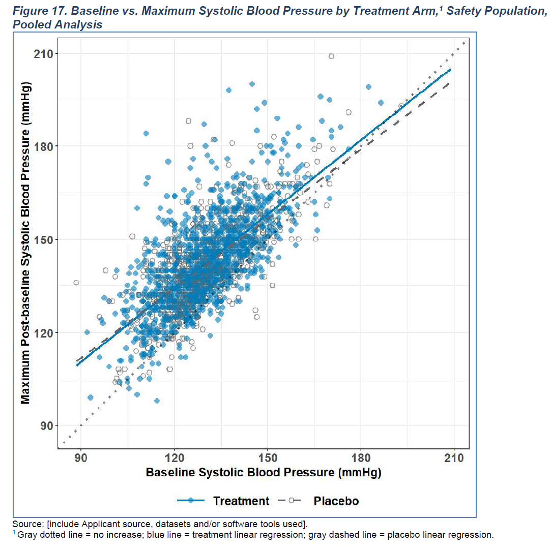
Figure 6.1: Sample figure from the SSTFIG (Figure 17)
6.2.6.2 Packages and Sample Data
Let’s start with accessing ADVS from the PhUSE Test Data Factory repository.
# Packages
library(ggplot2)
library(dplyr)

# Data
advs <- haven::read_xpt(
  paste0("https://github.com/phuse-org/TestDataFactory/",
         "raw/main/Updated/TDF_ADaM/advs.xpt"))
6.2.6.3 Data Wrangling
In order to make this example meaningful, data wrangling and processing steps will be covered here. In practice, you might have other considerations or processing steps that need to be considered.
The first step is to obtain baseline values for each USUBJID for the parameter and analysis time point of interest.
baseline <- advs %>%
  filter(
    SAFFL == "Y",
    PARAMCD == "SYSBP",
    ATPT == "AFTER LYING DOWN FOR 5 MINUTES",
    TRTA != "Placebo"
  ) %>%
  dplyr::select(USUBJID, TRTA, BASE) %>%
  distinct(USUBJID, .keep_all = TRUE)
The next step is to obtain the maximum value for each USUBJID post-baseline for the same parameter and analysis time point of interest.
post <- advs %>%
  filter(
    SAFFL == "Y",
    PARAMCD == "SYSBP",
    ATPT == "AFTER LYING DOWN FOR 5 MINUTES",
    TRTA != "Placebo",
    AVISIT != "Baseline",
    ANL01FL == "Y"
  ) %>%
  dplyr::select(USUBJID, AVAL) %>%
  group_by(USUBJID) %>%
  arrange(desc(AVAL)) %>%
  slice(1) %>%
  ungroup()
The last step is to merge these two data frames together.
all <- baseline %>%
left_join(post)| USUBJID | TRTA | BASE | AVAL |
|---|---|---|---|
| 01-701-1028 | Xanomeline High Dose | 138 | 137 |
| 01-701-1033 | Xanomeline Low Dose | 136 | 138 |
| 01-701-1034 | Xanomeline High Dose | 163 | 188 |
| 01-701-1097 | Xanomeline Low Dose | 128 | 137 |
| 01-701-1111 | Xanomeline Low Dose | 129 | 125 |
6.2.6.4 Basic Plot
Now that we have some data, we can start with a basic scatter plot.
ggplot(data = all, aes(x = BASE, y = AVAL)) +
  geom_point()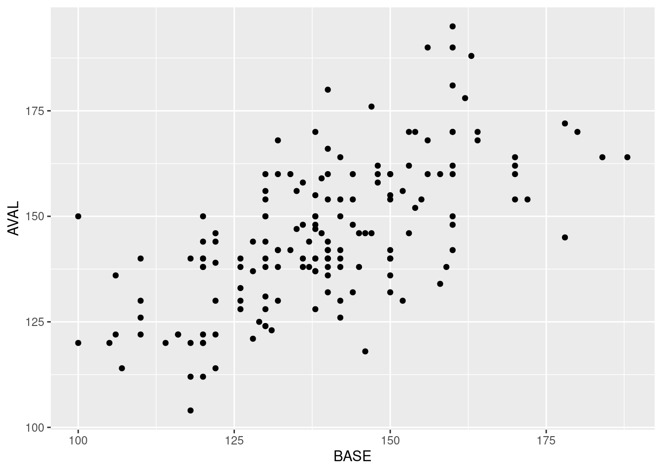
6.2.6.5 Customized Plot
We have a few customization to be included in order to match the figure provided in the SSTFIG. Below we separate the code and annotations in two different steps for clarity.
Let’s setup the plot annotations first. This includes headers, footers, and axis text.
yaxis_text <- "\nMaximum Post-baseline Systolic Blood Pressure (mmHg)\n"
xaxis_text <- "\nBaseline Systolic Blood Pressure (mmHg)"
header <- "Figure 17. Baseline vs. Maximum Systolic Blood Pressure by Treatment Arm, Safety Population¹, Pooled Analysis\n"
footer1 <- "Source: [include Applicant source, datasets and/or software tools used]."
footer2 <- "¹Gray dotted line = no increase; blue line = high-dose treatment linear regression; orange dashed line = low-dose linear regression."
Next, let’s extend our basic plot to include customizations we desire. One notable customization involves the use of stat_smooth(). This function will automatically compute the linear regressions for each treatment arm and append the lines of best fit to the plot.
f17 <- ggplot(all, aes(x = BASE, y = AVAL, linetype = TRTA)) +
  geom_point(colour = "black", shape = 21, size = 4, alpha = 0.6, aes(fill = TRTA)) +
  stat_smooth(method = "lm", se = FALSE, aes(color = TRTA)) +
  scale_color_manual(values = c("skyblue", "orange")) +
  scale_fill_manual(values = c("skyblue", "orange")) +
  geom_abline(intercept = 0, slope = 1, size = 1, lty = "dotted", color = "#5A5A5A") +
  scale_x_continuous(breaks = seq(90, 210, 30), limits = c(90, 210)) +
  scale_y_continuous(breaks = seq(90, 210, 30), limits = c(90, 210)) +
  labs(
    y = yaxis_text,
    x = xaxis_text,
    title = header,
    caption = paste(footer1, footer2, sep = "\n")
  ) +
  theme_light() +
  theme(
    panel.background = element_rect(fill = NA, color = "skyblue3", size = 2, linetype = "solid"),
    plot.caption = element_text(hjust = 0),
    legend.position = "bottom",
    legend.title = element_blank(),
    axis.text = element_text(face = "bold")
  )

f17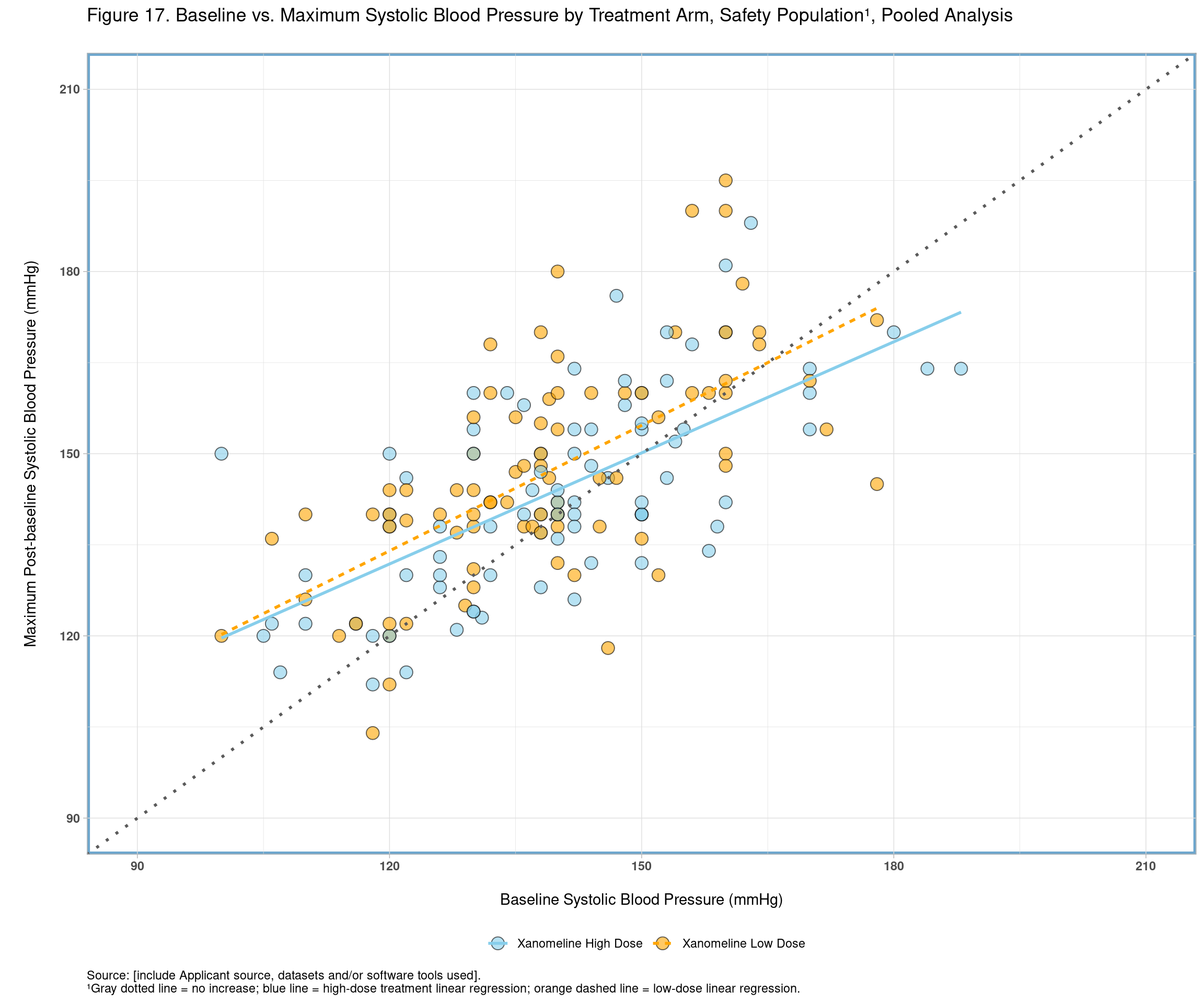
6.2.6.6 Confirmation
Using stat_smoooth() is a handy shortcut to achieve what we wanted. We should take some care to verify the results of this function are inline with what we expect. We can achieve this by manually running an lm().
coef <- all %>%
  filter(TRTA == "Xanomeline High Dose") %>%
  lm(data = ., AVAL ~ BASE) %>%
  coefficients()

coef
## (Intercept) BASE
## 58.6691789 0.6097608The next step is to see if this is congruent with what stat_smooth() provided in our plot. We’ll plot the coefficients and check whether they overlap, which would indicate they are similar.
all %>%
  filter(TRTA == "Xanomeline High Dose") %>%
  ggplot(., aes(x = BASE, y = AVAL)) +
  geom_point() +
  stat_smooth(method = "lm", se = FALSE, size = 5) +
  geom_abline(intercept = coef[[1]], slope = coef[[2]], color = "red")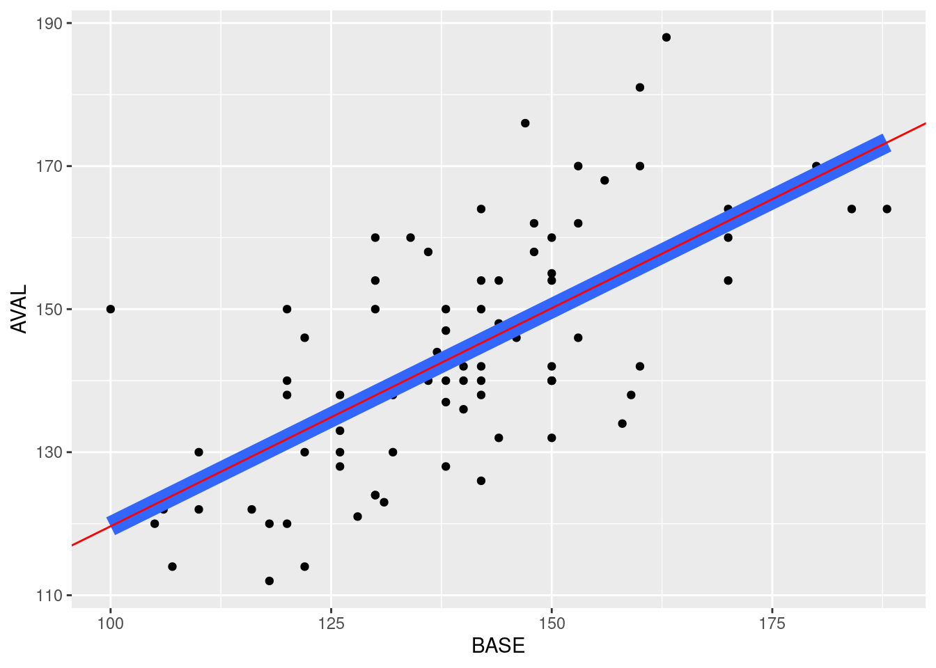
Looks okay!
6.2.6.7 More faithful aesthetics
While the above plot matched the technical specification, it did differ in a few aesthetics namely colors, and the border of the main plot. Below is code to achieve a closer aesthetic match with what’s in the SSTIF for the interested.
Line spaces have been removed from the beginning and end of text.
# setup plot text
yaxis_text_alt <- "Maximum Post-baseline Systolic Blood Pressure (mmHg)"
xaxis_text_alt <- "Baseline Systolic Blood Pressure (mmHg)"
header_alt <- "Figure 17. Baseline vs. Maximum Systolic Blood Pressure by Treatment Arm, Safety Population¹, Pooled Analysis"
footer1_alt <- "Source: [include Applicant source, datasets and/or software tools used]."
footer2_alt <- "¹Gray dotted line = no increase; blue line = high-dose treatment linear regression; grey dashed line = low-dose linear regression."
Colors and border contexts have changed. Title/footers have been re-factored using patchwork::plot_annotation()
f17_alt <- ggplot(all, aes(x = BASE, y = AVAL, linetype = TRTA)) +
  geom_point(colour = "black", shape = 21, size = 4, alpha = 0.6, aes(fill = TRTA)) +
  stat_smooth(method = "lm", se = FALSE, aes(color = TRTA)) +
  scale_color_manual(values = c("skyblue", "grey")) +
  scale_fill_manual(values = c("skyblue", "white")) +
  geom_abline(intercept = 0, slope = 1, size = 1, lty = "dotted", color = "#5A5A5A") +
  scale_x_continuous(breaks = seq(90, 210, 30), limits = c(90, 210)) +
  scale_y_continuous(breaks = seq(90, 210, 30), limits = c(90, 210)) +
  labs(
    y = yaxis_text_alt,
    x = xaxis_text_alt
  ) +
  theme_bw() +
  theme(
    plot.background = element_rect(fill = NA, color = "skyblue3", size = 2, linetype = "solid"),
    legend.position = "bottom",
    legend.title = element_blank(),
    axis.text = element_text(face = "bold")
  )

# Use the patchwork package to specify title, caption (e.g. footers) and footers position (i.e. left align) to get a closer aesthetic feel.
library(patchwork)
f17_alt + patchwork::plot_annotation(title = header_alt,
                                     caption = paste(footer1_alt, footer2_alt, sep = "\n"),
                                     theme = theme(plot.caption = element_text(hjust = 0)))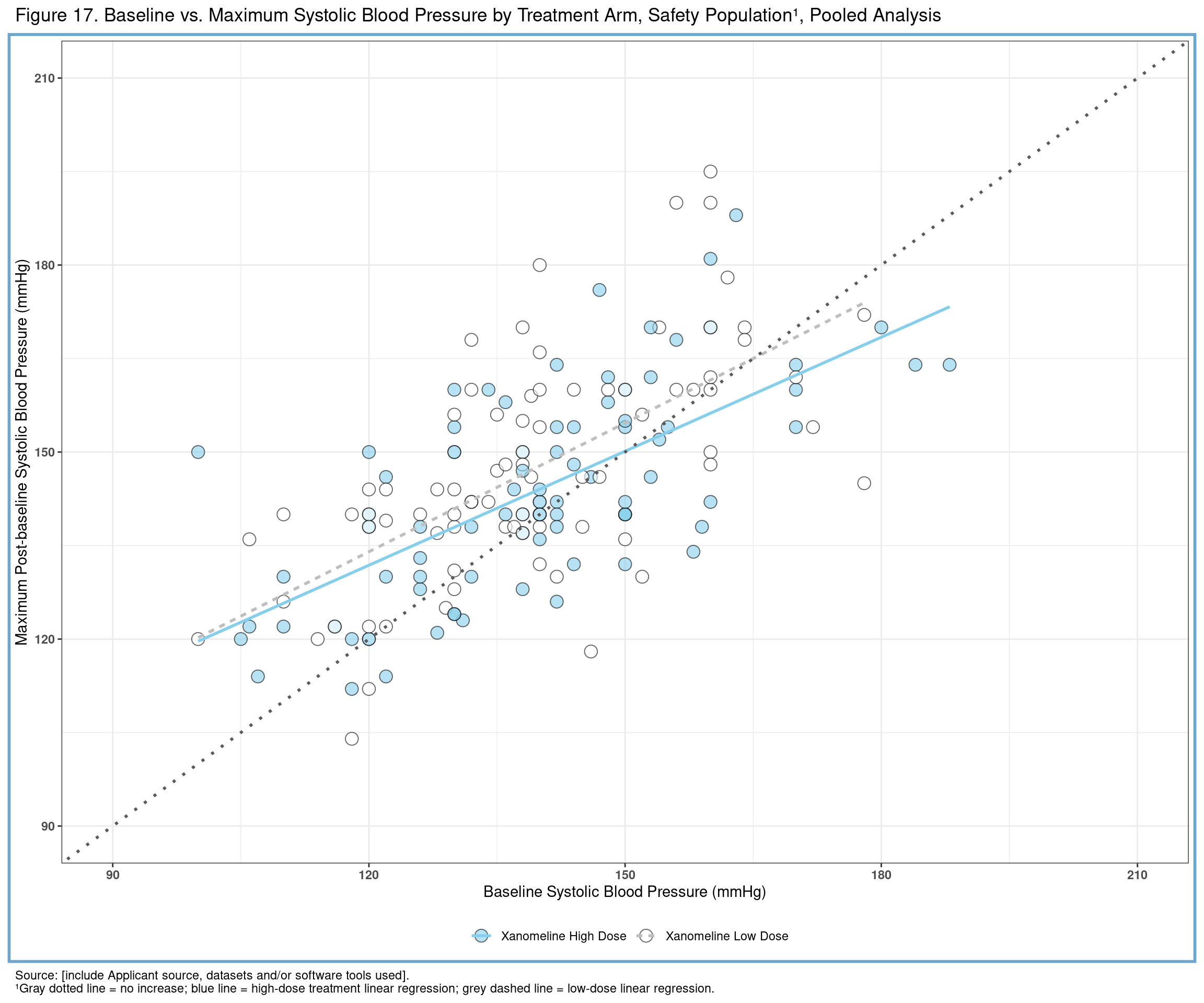
6.2.7 Tornado Plot
6.2.7.1 Overview
This article will demonstrate how to construct a tornado plot in ggplot2. A tornado plot is useful for comparing counts (or percents) of events in a back-to-back fashion. They can highlight equalities or imbalances by symmetry between treatment arms and also provide a view of each distribution separately.
6.2.7.2 Packages and Sample Data
Let’s start with accessing ADAE from the PhUSE Test Data Factory repository.
# Packages
library(ggplot2)
library(dplyr)
library(ggh4x)

# Data
adae <- haven::read_xpt(
  paste0("https://github.com/phuse-org/TestDataFactory/",
         "raw/main/Updated/TDF_ADaM/adae.xpt"))
6.2.7.3 Data Wrangling
In order to make this example meaningful, data wrangling and processing steps will be covered here. In practice, you might have other considerations or processing steps that need to be considered.
The first step is to prepare the data for wrangling. For this example, we will limit our focus on only 2 of 3 treatment arms and select relevant variables for tabulation.
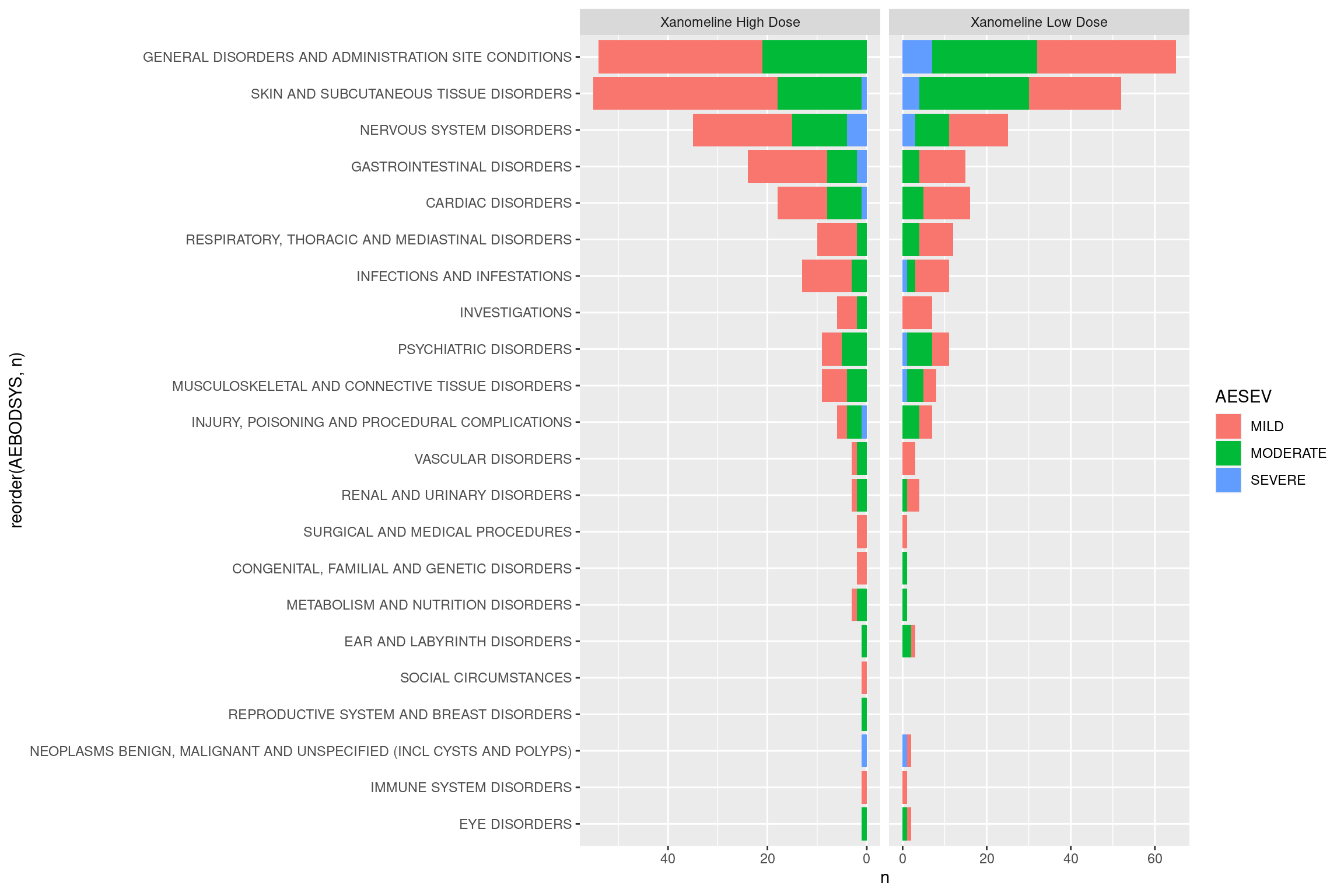
start <- adae %>%
  select(TRTA, USUBJID, AESEV, AEBODSYS) %>%
  filter(TRTA != "Placebo")
The next step is to tabulate unique counts, per subject, of the adverse event (AEBODSYS) by severity combinations.
event_counts <- start %>%
  distinct(USUBJID, AEBODSYS, AESEV, .keep_all = TRUE) %>%
  count(TRTA, AEBODSYS, AESEV)
6.2.7.4 Basic Plot
Now that we have some data, we can start with a basic tornado plot. We will rely on the facetted_pos_scales() function from the {ggh4x} package to help position scales.
ggplot(event_counts, aes(fill = AESEV, y = n, x = reorder(AEBODSYS, n))) +
  geom_bar(position="stack", stat="identity") +
  coord_flip() +
  facet_wrap(~ TRTA, scales = "free_x") +
  facetted_pos_scales(y = list(
    scale_y_reverse(),
    scale_y_continuous())
  )
6.2.7.5 Customized Plot
We have a few customization to be included in order to make this plot more presentable. Specifically, we will:
- Specify a custom fill palette
- Set the y-scales of each individual facet. In the basic plot above, notice that they differ slightly. This is not ideal for visual comparisons.
- Modify a few elements related to the theme, including the legend and facet panels
- Add x and y axis test
ggplot(event_counts, aes(fill = AESEV, y = n, x = reorder(AEBODSYS, n))) +
  geom_bar(position="stack", stat="identity", color = "black") +
  coord_flip() +
  scale_fill_brewer(palette = "Blues") +
  facet_wrap(~ TRTA, scales = "free_x") +
  facetted_pos_scales(y = list(
    scale_y_reverse(breaks = seq(70,0,-10), limits = c(70,0)),
    scale_y_continuous(breaks = seq(0,70,10), limits = c(0,70)))) +
  theme_bw() +
  theme(legend.position = "bottom",
        legend.title = element_blank(),
        strip.text = element_text(color = "white"),
        strip.background = element_rect(fill = "royalblue"),
        axis.text = element_text(face="bold")) +
  labs(y = "Number of Subjects", x = "System Organ Class")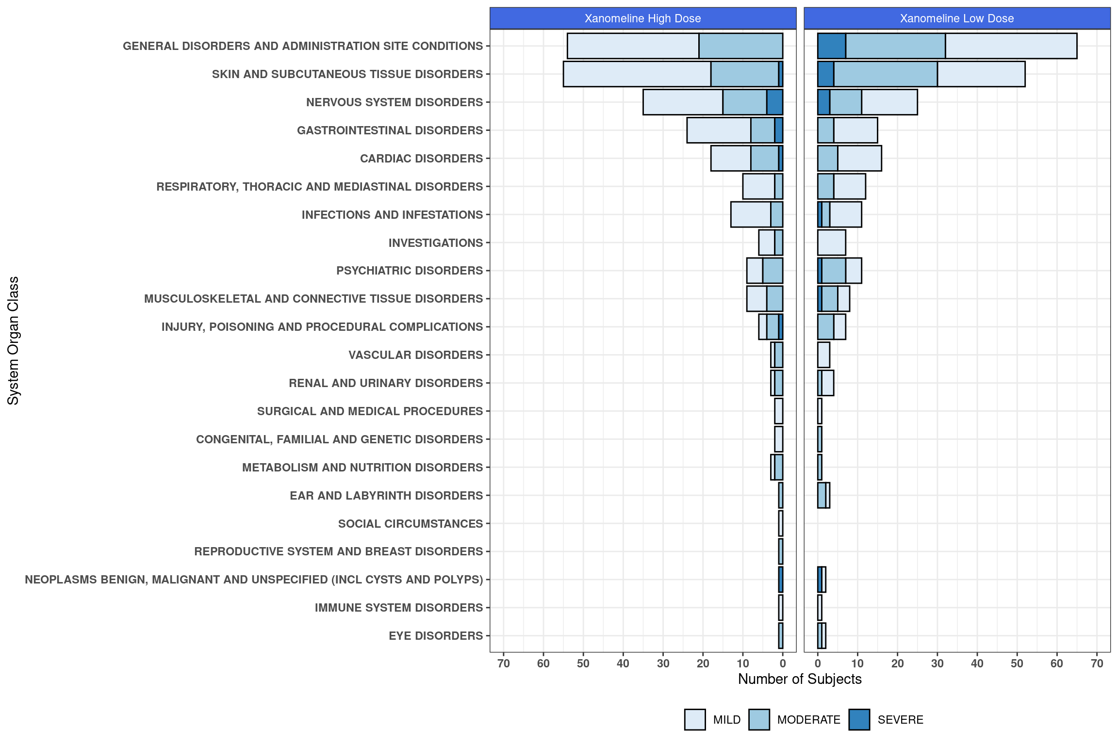
6.2.8 Safety Plots
Again, we refer to the FDA safety guide which you can find int he scatterplot section. The falcon package aims to cover all tables and plots eventually. However, similar visualisation might be of interest also outside of this package. This is why we provide some code here to show how to combine a plot and a table using the patchwork package.
But we start with loading the required libraries and adsl and adlb dataset:
### load relevant libraries and data

library(dplyr)
library(haven)
library(patchwork)
library(ggplot2)


adam_path <- "https://github.com/phuse-org/TestDataFactory/raw/main/Updated/TDF_ADaM/"
adsl <- read_xpt(paste0(adam_path, "adsl.xpt"))
adlb <- read_xpt(paste0(adam_path, "adlbc.xpt"))


# prepare lab data set for plotting

data <- adlb %>%
  filter(PARAMCD == "SODIUM" & !is.na(AVISIT)) %>%
  select(USUBJID, TRTA, AVISIT, PARAM, AVAL, BASE, CHG) %>%
  mutate(AVISIT = factor(AVISIT, levels = c("Baseline", "Week 2", "Week 4", "Week 6", "Week 8", "Week 12",
"Week 16", "Week 20", "Week 24", "Week 26", "End of Treatment")))| USUBJID | TRTA | AVISIT | PARAM | AVAL | BASE | CHG |
|---|---|---|---|---|---|---|
| 01-701-1015 | Placebo | Baseline | Sodium (mmol/L) | 140 | 140 | NA |
| 01-701-1015 | Placebo | Week 2 | Sodium (mmol/L) | 142 | 140 | 2 |
| 01-701-1015 | Placebo | Week 4 | Sodium (mmol/L) | 140 | 140 | 0 |
| 01-701-1015 | Placebo | Week 6 | Sodium (mmol/L) | 140 | 140 | 0 |
| 01-701-1015 | Placebo | Week 8 | Sodium (mmol/L) | 141 | 140 | 1 |
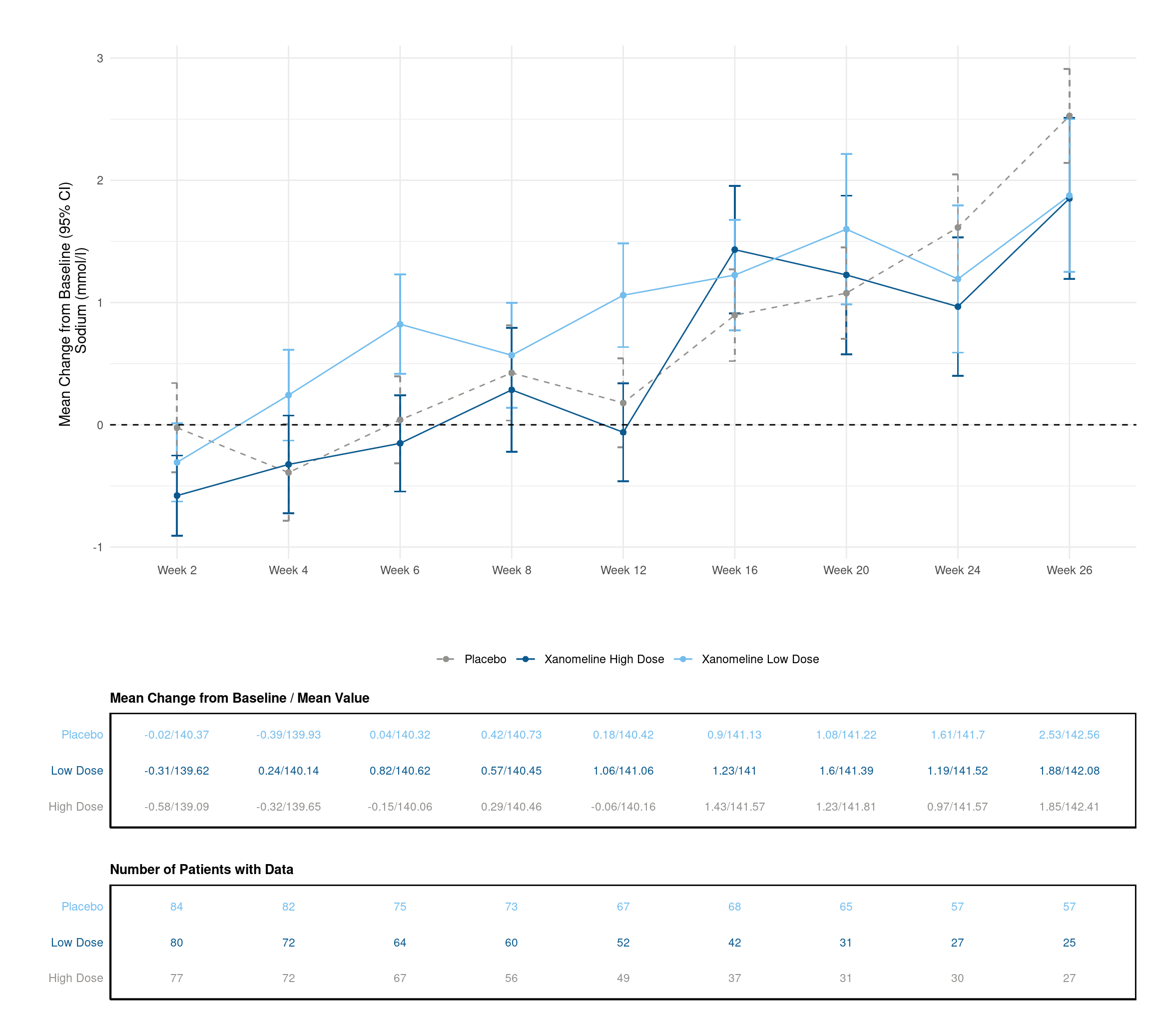
Now, we create a line plot which deomnstrates the change of the average of Sodium per week. Each line represents one dose. Additionally, we also provide the standard error intervals.
# create plot
p <- data %>%
filter(!AVISIT %in% c("Baseline", "End of Treatment") & !is.na(AVISIT)) %>%
group_by(AVISIT, TRTA) %>%
mutate(mean_chg = mean(CHG, na.rm = TRUE),
se_chg = sd(CHG, na.rm = TRUE) / sqrt(length(CHG))) %>%
ungroup() %>%
ggplot(., aes(x=AVISIT, y=mean_chg, group=TRTA, linetype = TRTA)) +
geom_errorbar(aes(ymin=mean_chg-se_chg, ymax=mean_chg+se_chg, color=TRTA), width=.1) +
geom_line(aes(color=TRTA)) +
geom_point(aes(color=TRTA)) +
geom_hline(yintercept=0, linetype='dashed')+
scale_linetype_manual(values = c("dashed",rep("solid",2))) +
scale_color_manual(values=c("#93918E","#0B5A8F", "#73BDEE")) +
labs(x = "", y = "Mean Change from Baseline (95% CI) \n Sodium (mmol/l)") +
theme_minimal() +
theme(legend.position="bottom",
legend.title=element_blank()) +
coord_fixed() +
theme(aspect.ratio = 0.5)
p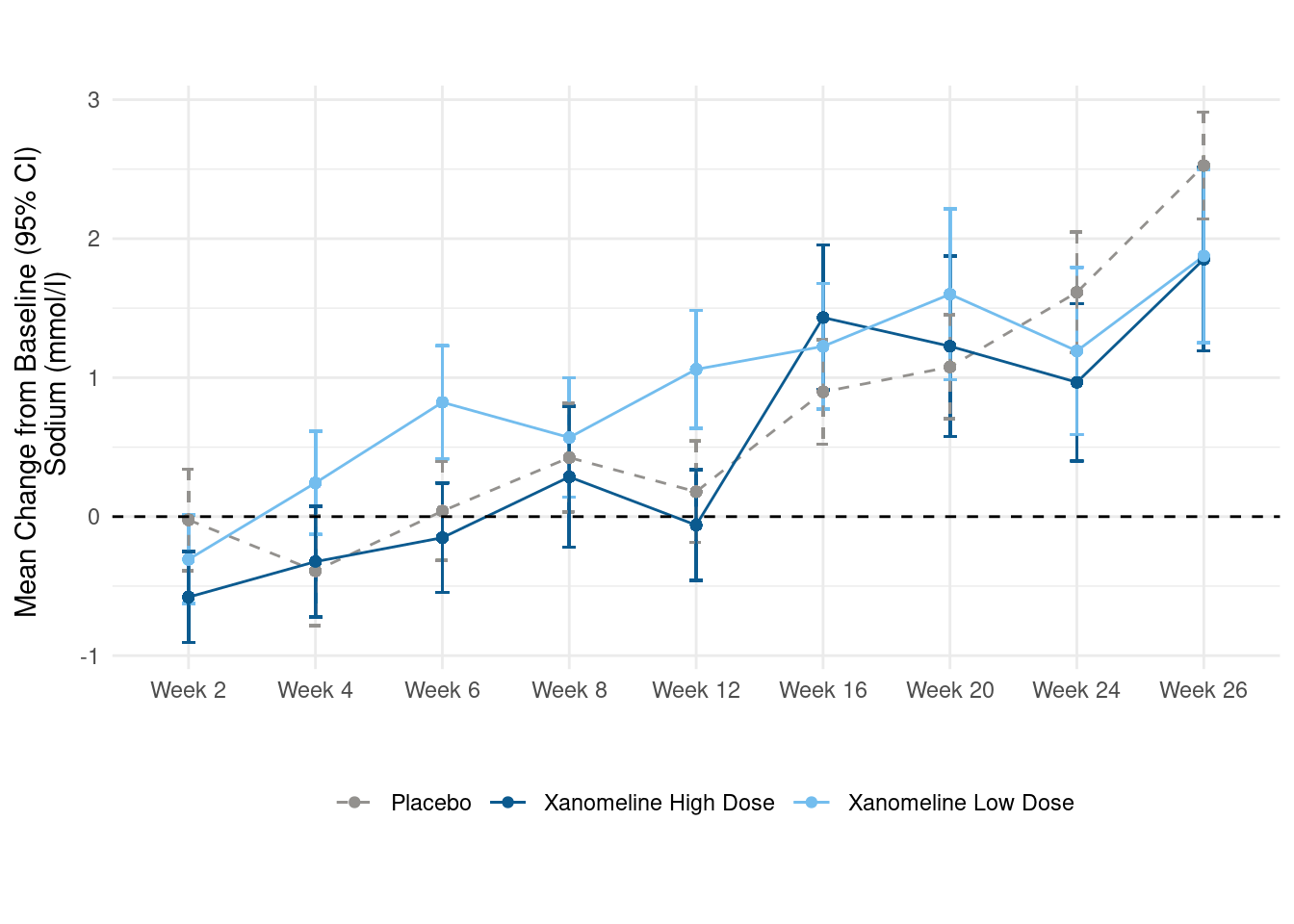 Addtionally, we would like to create two tables. The first one should display the mean change from baseline and the mean value for each visit, the second one the number of subjects per visit.
# prepare data for table

table_data <- data %>%
  filter(!AVISIT %in% c("Baseline", "End of Treatment") & !is.na(AVISIT)) %>%
  group_by(AVISIT, TRTA) %>%
  mutate(mean_chg = mean(CHG, na.rm = TRUE),
         mean_aval  = mean(AVAL, na.rm  = TRUE),
         n_patients = n_distinct(USUBJID),
          n_patients = n_distinct(USUBJID),
         TRTA = case_when(
           TRTA == "Xanomeline High Dose" ~"High Dose",
           TRTA == "Xanomeline Low Dose" ~ "Low Dose",
           TRUE ~ TRTA)) %>%
  ungroup() %>%
  select(TRTA, AVISIT, mean_chg, mean_aval, n_patients) %>%
  distinct()

data_table1 <- table_data %>%
  select(-n_patients) %>%
  mutate(value = paste0(round(mean_chg, 2), "/", round(mean_aval, 2)))

data_table2 <- table_data %>%
select(-mean_chg, -mean_aval)| TRTA | AVISIT | mean_chg | mean_aval | value |
|---|---|---|---|---|
| Placebo | Week 2 | -0.0238095 | 140.3690 | -0.02/140.37 |
| Placebo | Week 4 | -0.3902439 | 139.9268 | -0.39/139.93 |
| Placebo | Week 6 | 0.0400000 | 140.3200 | 0.04/140.32 |
| Placebo | Week 8 | 0.4246575 | 140.7260 | 0.42/140.73 |
| Placebo | Week 12 | 0.1791045 | 140.4179 | 0.18/140.42 |
Now, we transform the table to a plot to be able to style it and display it aligned with the visualisation above.
# plot table 1

p_table1 <- ggplot(data = data_table1, aes(x = AVISIT, y = TRTA)) +
  scale_shape_manual(values = 1:length(data_table1$TRTA))+
  ggpubr::geom_exec(geom_text, data = data_table1, label = data_table1$value, color = "TRTA", size=3) +
  theme_classic() +
  labs(title = "Mean Change from Baseline / Mean Value", x = "", y = "" ) +
  scale_color_manual(values=c("#93918E","#0B5A8F", "#73BDEE")) +
  theme(axis.text.y = element_text(colour = c("#93918E","#0B5A8F", "#73BDEE")),
        axis.text.x=element_blank(),
        axis.ticks.x=element_blank(),
        axis.ticks.y=element_blank()) +
  theme(legend.position="none",
        panel.border = element_rect(colour = "black", fill=NA, size=1),
        plot.title = element_text(size=10, face = "bold"))


# just for the sake of displaying it

p_table1 +
    coord_fixed(ratio=.5)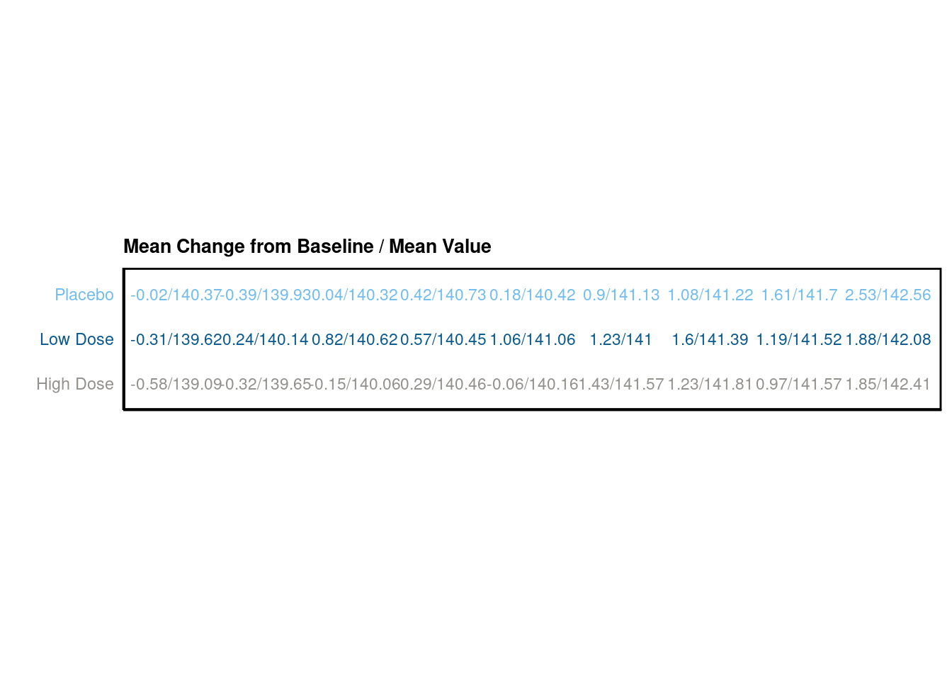
We do the same for the second table.
# plot table 2

p_table2 <- ggplot(data = data_table2, aes(x = AVISIT, y = TRTA)) +
  scale_shape_manual(values = 1:length(data_table2$TRTA))+
  ggpubr::geom_exec(geom_text, data = data_table2, label = data_table2$n_patients, color = "TRTA", size=3) +
  theme_classic() +
  labs(title = "Number of Patients with Data", x = "", y = "" ) +
  scale_color_manual(values=c("#93918E","#0B5A8F", "#73BDEE")) +
  theme(axis.text.y = element_text(colour = c("#93918E","#0B5A8F", "#73BDEE")),
        axis.text.x=element_blank(),
        axis.ticks.x=element_blank(),
        axis.ticks.y=element_blank()) +
  theme(legend.position="none",
        panel.border = element_rect(colour = "black", fill=NA, size=1),
        plot.title = element_text(size=10, face = "bold"))

# just for the sake of displaying it

p_table2 +
    coord_fixed(ratio=.5)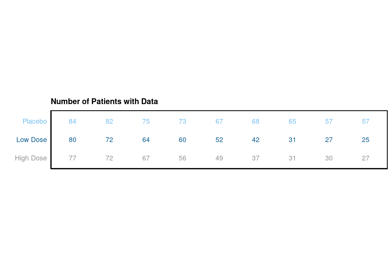
Finally, we combine all three visualisations using the patchwork package functionality:
# combine plots

final_plot <- p + p_table1 + p_table2

# display plot w/ layout
final_plot + plot_layout(byrow = FALSE,
                        heights = c(5,1,1))